TYPOGRAPHY/TASK 1: EXERCISE 1 & 2
30/09/2023 - 27/10/2023 / Week 1 - Week 5
Marsya Arisa Binti Mahmud / 0359684
Marsya Arisa Binti Mahmud / 0359684
Typography / Bachelor of Design (Hons) in Creative Media / Taylor's University
Task 1: Exercise 1 & 2
Table of Contents
LECTURES
WEEK 1 - 30/09/2023
Typography:
- Act of creating letters
- Creation of typefaces
- Animation
- Website and application designs
- Signage design
- Books and posters
- Trademarks
Writing Styles:
- Calligraphy: The writing styles (ex: black letter, unsealed, round hand, etc)
- Lettering: Drawing the letters out (drawing out the circumference of letters)
- Typography
1. Early letterform development: Phoenician to Roman


Figure 1.1: Development of letters within 1000 B.C.E.
Boustrophedon
A writing style developed by the Greek, which meant the texts read switches alternatively from right to left and left to right.

Figure 1.2: Example of Boustrophedon
2. Hand script from 3rd to 10th Century C.E.
Square Capitals
Found in Roman monuments as written letters. Serifs are added to finish of the main strokes in this letterform.

Figure 1.3: 4th or 5th Century (Square Capitals)
Rustic Capitals
Allows twice as many words on a sheet of parchment and takes less time to write. Though it is slightly harder to read due to their compressed nature.

Figure 1.4: Late 3rd or mid 4th (Rustic Capitals)
Roman Cursive
Cursive is simplified for speed, typically used for everyday transactions. The beginning of lowercase letterforms.

Figure 1.5: 4th Century (Roman Cursive)
Letters that are one inch high. The broader forms are easier to read at small sizes compared to rustic capitals

Figure 1.6: 4th - 5th Century (Uncials)
Half-uncials
The formal beginning of lowercase letterforms, 2000 years after the origin of the Phoenician alphabet.

Figure 1.7: C. 500 (Half-uncials)
Caloline Miniscule
Monks rewrote the texts using both majuscules (uppercase), miniscule, capitalization and punctuation which set the standard for calligraphy for a century.

Figure 1.8: C. 925 (Caloline Miniscule)
3. Blackletter to Gutenberg's Type
Blackletter
With the dissolution of Charlemagne’s empire came regional variations upon Alcuin’s script. In northern Europe, a condensed strongly vertical letterform know as Blackletter or textura gained popularity. In the south, a rounder more open hand gained popularity, called ‘rotunda’. The humanistic script in Italy is based on Alcuin’s minuscule.

Figure 1.9: C. 1300 (Blackletter: Textura)
4. Text Type Classification

Figure 1.10: Text Type Classification
Keyboard Shortcuts on AI
Increases size of word: Command + Shift + Greater Than Key
Increases size of word faster: Command + Shift + Alt
Turns off the margin: Command + Colon
Reduces the amount of space (Kerning): Option/Alt + Left Arrow
Increases the amount of space (Kerning): Option/Alt + Right Arrow
Space control: Preference > Units & Increments > Reduce Kerning
1. Kerning and Letterspacing
Kerning: Automatic adjustment of space between letters, normally used for headers
Letterspacing: Adding space between the letters
Tracking: Addition and removal of space in a word or sentence

Figure 2.1: Kerning and letterspacing
Normal Tracking, Loose Tracking & Tight Tracking
- Designers letter space uppercase letters
- Uppercase letterforms are able to stand on their own
- Lowercase letterforms require counter forms between letters to maintain line of reading
Figure 2.2: Types of Tracking
Flush Left
- Mirrors the asymmetrical experience of handwriting
- Each line starts at the same point but ends where the last word on the line ends
- Spaces are consistent, even gray value (text on a white page)

Figure 2.3: Flush left
Centered
- Imposes symmetry upon text (equal value and weight to both ends)
- Creates a strong shape on the page
- Important to amend line breaks so that the text does not appear jagged

Figure 2.4: Centered
Flush Right
- Emphasises end of a line as opposed to its start
- Useful for captions where text and image might be ambiguous without a strong orientation to the right

Figure 2.5: Flush right
Justified
- Imposes a symmetrical shape on the text
- Expanding or reducing spaces between words and letters
- Requires more kerning
- Gaps within the text is not good

Figure 2.6: Justified
3. Texture

Figure 2.7: Anatomy of a Typeface

Figure 2.8: Typefaces and gray values
4. Leading and Line Length
Type Size: Should be large enough to read easily
Leading: Tight texts encourages vertical eye movement (a reader can lose their place), too lose could distract the reader
Line Length: Shorter lines require less reading, keep line length between 55-56 characters

Figure 2.9: Bad Leading
Left: No leading, colour is too dark
Right: Too much leading, colour is too light
Example of Good Leading

Figure 2.10: Good Leading
5. Type Specimen Book
Provides an accurate reference for type, type size, type leading, type line length etc.

Figure 2.11: Sample Type Specimen Sheet
Compositional Requirement: Text should create a field that can occupy a page. Ideal text as having middle gray, not a series of stripes.
WEEK 3 - 14/10/2023
6. Indicating Paragraphs
Pilcrow (¶): a holdover from medieval manuscripts seldom use today
Line space: ensures cross-alignment across columns of text
Difference between Line space and Leading
Line space: base line of one sentence to descender of the other sentence
Leading: space between two sentences
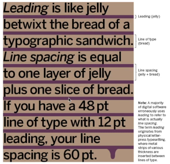
Figure 3.1: Line space vs leading
Standard Identation
- Typically is the same size of the line spacing or the same as the point size of your text
- Often occurs in newspapers to save space
- Never use left alignment, best used justified

Figure 3.2: Identation
Extended Paragraphs
- Creates unusually wide columns of text
- Used in academic writing

Figure 3.3: Extended paragraphs
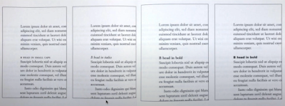
7. Widows and Orphans
Two unpardonable gaffes that should be avoided
Widows: short line of type left alone at the end of a column of text
Orphans: short line of type left alone at the start of a new column

Figure 3.4: Example of Widows and Orphans
Widows: rebreak your line endings through out your paragraphs so that the last line of any paragraph is not noticeably short
Orphans: no column of text starts with the last line of the preceding paragraph


9. Headline within Text

 '
'


8. Highlighting Text
Different kinds of emphasis require different kinds of contrast (ex: italics, bold, change typeface, highlighting)

Figure 3.5: Example of Highlighting Text
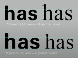
Changing Typeface
Changing from sans serif to serif means reducing it by .5

Figure 3.6: Reducing font size
In this example, sans serif font (Univers) has been reduced by .5 to match the x-height of the serif typeface
Maintain a Strong Reading Axis
- Sometimes it is necessary to place certain elements outside the left margin of a column of type
- Quotation marks (bullets) create clear indent, breaking the left reading axis

Figure 3.7: Comparing of indented quotes
It is important to signify the importance within the text
Text A
- Indicates a clear break between the topics
- Set larger than the text

Figure 3.8: Example of A
Text B
- Subordinate to A heads
- Indicates a new supporting argument or example of topic at hand
- Does not interrupt the text as strongly as Text A
- Could be shown in small caps, italic, bold serif and bold san serif
 '
'Figure 3.9: Example of B
Text C
- Not common
- Highlights specific facets of material within Text B
- Shown in small caps, italics, serif bold and san serif bold
- Followed by at least an em space for visual separation

Figure 3.10: Example of C
10. Cross Alignment
Cross aligning headlines and captions with text type reinforces the architectural sense of the page (structure)

Figure 3.11: Example of Cross Alignment
In this example, four lines of the caption type (leaded 9 pts) cross-align with three lines of text type (leaded to 13.5pts)
WEEK 4 - 20/10/2023
Typography Basics
1. Describing Letterforms
Knowing a letterform''s component parts make it easier to identify typefaces:
Baseline: Imaginary line the visual base of the letterforms
Median: Imaginary line defining the x-height of letterforms
X-height: Height in any typeface of the lowercase 'x'
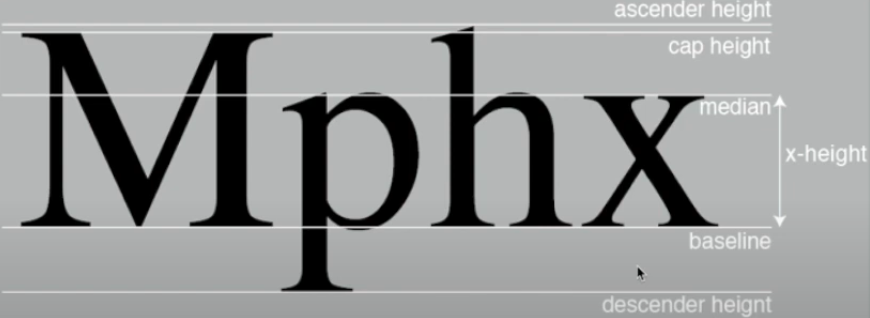
Figure 4.1: Example of Letterforms
Stroke: Any line that defines the basic letterform
Apex/Vertex: Point created by joining two diagonal stems (apex above and vertex below)
Arm: Short strokes off the stem of the letterform, either horizontal (E,F,L) or inclined upward (K,Y)
Ascender: The portion of the stem of a lowercase letterform that projects above the median
Barb: Half-serif finish on curved stroke
Beak: Half-serif finish on some horizontal arms
Bowl: Rounded form that describes a counter (May be open or closed)
Bracket: Transition between the serif and the stem
Cross Bar: Horizontal stroke in a letterform that joins two stems together
Cross Stroke: Horizontal stroke in a letterform that joins two stems together
Crotch: Interior space where two strokes meet
Ear: Stroke extending out from the main stem or body of letterform
Em/en: Width of an uppercase M, and em is the distance equal to the size of typeface (Ex: if em is 48 pts, an en is half the size)
Leg: Short stroke off the steam of the letterform
Ligature: Character formed by the combination of two or more letterforms
Link: Stroke that connects the bowl and the loop of a lowercase G
Spur: Extension that articulates the junction of the curved and rectilinear stroke
Spine: Curved stem of the S
Stress: Orientation of letterforms, indicated by thin stroke in round forms
Swash: Flourish that extends the stroke of the letterform
Terminal: Self-contained finish of a stroke without a serif
2. The Font
Typeface contains more than 26 letters, to numerals, and a few punctuation marks:
Uppercase: Capital letters, including certain accented vowels
Lowercase: Includes the same characters as uppercase
Small Capitals: Uppercase letterforms draw to the x-height of the typeface (found in serif fonts)
Uppercase Numerals: Same height as uppercase letters and are set with same kerning width
Lowercase Numerals: Set to x-height with ascenders and descenders (less common in sans serif)
Punctuation/miscellaneous Characters: Characters change from typeface to typeface
Ornaments: Flourishes in invitations or certificates (larger typeface family)
3. Describing Typefaces
Once you can recognize the parts of a letterform, you can identify different typefaces:
Roman: Uppercase forms are derived from inscriptions of Roman monuments (a lighter stroke in roman)
Italic: Fifteenth century Italian handwriting on which the forms are based (Oblique is based on roman form)
Boldface: Thicker stroke than a roman form (Ex: semibold, medium, black, extra bold, super)
Light: Lighter stroke than roman form (Ex: thin)
Condense: A version of the roman form (condense)
Extended: Extended variation of a roman font

Figure 4.2: Example of Typefaces
4. Comparing Typefaces
Beyond the difference in x-height, the forms display a wealth of variety in line weight, relative stroke widths and in feeling.

Figure 4.3: Types of Typefaces
WEEK 5 - 27/10/2023
1. Understanding Letterforms
The uppercase letterform below suggest symmetry, but it is not. It is easy to see two different stroke weights of the Baskerville stroke form.

Figure 5.1: Baskerville 'A'
The uppercase letterform may appear symmetrical, but the width of the left slope is thinner than the right stroke. Baskerville (previous) and Univers (below) demonstrate meticulous care.

Figure 5.2: Univers 'A'
By examining the lowercase 'a' of two seemingly similar sans-serif typefaces - Helvetica and Univers. Comparison of the stems of the letterforms finish and how the bowls meet the stems quickly reveals the palpable difference in character between the two.

Figure 5.3: Helvetica vs Univers
2. Maintaining x-height

Figure 5.4: Lowercase Letterforms
Curved strokes, such as in ‘s’, must rise above the median (or sink below the baseline) in order to appear to be the same size as the vertical and horizontal strokes they adjoin.
3. Form/Counterform
When letters are joined to form words, the counterform includes the spaces between them. How well are the counters handled determines how well the words hang together- in other words, how easily we can read what’s been set.

Figure 5.5: Example of Form/Counterform

Figure 5.6: Example of Contrast
INSTRUCTIONS
1. Type Expression
(a) Choose 4 out of the 8 words given: Smoke, Soup, Spooky, Power, Impact, Crunch, Drunk, Fold. Use the appropriate typefaces out of the 10 typefaces provided to compose the letters in a manner that allows the meaning to become visible - still and in motion.
(b) Export artwork in JPEG: File > Export > Export As > Format: select JPEG > tick: Use Artboards > Range: Select Artboard Number > Export > Colour Model: Grayscale > Resolution 300 ppi > Ok
(c) When exporting as GIF: Grayscale, 72 ppi, does not exceed 1024px (width and height), white background
2. Text Formatting
(a) Increment amounts of texts will be given that addresses different areas within text formatting. The submission includes one layout in A4 size demonstrating the incremental exercises.
(b) Exporting as JPEG: File > Export > [File Location] > Save > JPEG, 300 ppi, Grayscale > Export
(c) Exporting as PDF: File > Adobe PDF Presets > High Quality Print > [File Location] > Save > Export
(d) Export as PDF with Guides: File > Adobe PDF Presets > High Quality Print > Save > Select ‘Visible Guides and Grids’ > Export
(e) Export as JPEG with Guides: Open PDF > Export a PDF > Image > JPEG
<iframe src="https://drive.google.com/file/d/1owRseXP-FxTMMuXai7oDSyhPShYw9s0W/preview" width="640" height="480" allow="autoplay"></iframe>
WORK PROCESS
TASK 1: EXERCISE 1
1. Type Expression
For this task, I've chosen the words: Soup, Impact, Fold and Drunk. Mainly because it stood out to me the most and I could envision many possible concepts I could experiment with.
1.1 Research
I carried out my research by searching up the meaning of each word and skimming through Pinterest. I created a board to gather inspiration for the words I have chosen. I find this helpful because it helps me keep track of my ideas.
Board: https://pin.it/67rO9FZ
Soup: A liquid dish, typically savoury and made by boiling meat, fish, or vegetables etc. in stock or water.

Figure 1.1: Soup
Impact: The action of one object coming forcibly into contact with another.

Figure 1.2: Impact
Fold: Bend (something flexible and relatively flat) over on itself so that one part of it covers another.

Figure 1.3: Fold
Drunk: Affected by alcohol to the extend of losing control of one's faculties or behaviour.

Figure 1.4: Drunk
1.2 Sketches
Soup

Figure 1.5: Sketches for Soup
Sketch 1: The letters shapes out the soup itself, the idea of making it look liquid.
Sketch 2: The letters de-escalate to visualise a pouring action.
Sketch 3: The 'O' is made horizontal, with the intent of being a bowl.
Sketch 4: Similar to Sketch 3, with a graphic element of a bowl while 'U' and 'P' are contents of the bowl.
Sketch 5: The 'U' is bigger to emphasize that it is the outer part of the bowl.
Sketch 6: A pouring effect, similar to Sketch 2 except the font size ascends.
Impact

Figure 1.6: Sketches for Impact
Sketch 1: The letters grow bigger, much like a loud noise when there is impact.
Sketch 2: The scattered letters visualise pieces breaking after an impact.
Sketch 3: 'P' and 'A' is made bigger to emphasize that certain parts could give an impact, much like life itself.
Sketch 4: Similar to Sketch 2, except the letter size increases, with scattered letters to visualize an impact.
Sketch 5: The words are colliding or coming into contact with one another.
Sketch 6: Similar concept as Sketch 3.
Fold

Figure 1.7: Sketches for Fold
Sketch 1: A slight bend to parts of the letters.
Sketch 2: The duplicates of letters are split, with the idea of making it look like a pile of folded clothes.
Sketch 3: The letters are bent, like they are about to fold.
Drunk

Figure 1.8: Sketches for Drunk
Sketch 1: Being drunk makes you feel like you are upside down.
Sketch 2: The distortion of the one below gives the idea of being tipsy.
Sketch 3: The 'U' size getting bigger shows that being drunk makes you talk louder, or rather make you talkative.
Sketch 4: The concept of being in denial when you are drunk.
Sketch 5: Being drunk makes you sleepy, the 'U' gives a snoozing effect.
Sketch 6: The 'U' falling emphasizes that drunk people are clumsy.
Sketch 7: The 'U' is to show the upper part of a wine glass, and the idea of there being more than one is because you get drunk when you drink multiple glasses of wine.
1.3 Digitization
Soup

Figure 1.9: Process for Soup
For Soup, I decided to do Sketch 3 from my sketching process. I've also chosen Futura Condensed Medium as the font because the 'O' within this font looks like the opening of a bowl to me and the rest of the letters give off a circular and compressed impression, like noodles in a soup. The concept is that the 'S' is about to be poured into the bowl whilst 'U' and 'P' are already floating in the bowl.
Impact

Figure 1.10: Process for Impact
For Impact, I decided to do Sketch 4 and the font I have chosen is Univers LT Std 67 Bold Condensed Oblique. I've used italics and increased the kerning so that the letters look like they have been pushed against one another. I've also changed the size of the font for each letter to emphasise more on the impact. In addition, I added a few scattered letters so that that words looks like its been impacted towards an object.

1.11: Process for Fold
For Fold, I chose to do Sketch 3 to make it look like the letters are bent, as though they are about to fold. The font used is Univers LT Std 55 Roman because it reminds me of a sheet of paper. In this process, I changed the text into an object and used the knife tool to split the letters in half. I then used the free transform tool to distort the bottom half of the letters.
Drunk

1.12: Process for Drunk
For Drunk, I chose Sketch 5. The concept of this is that being drunk makes you sleepy. I used Bembo Std Semibold as the font mainly because it looks classy, like how wine is classy. But at the same time the 'U' passing out and falling asleep also contradicts that idea when you drink too much 'wine' and get drunk. I increased the kerning between 'U' and 'K', I also turned the letters into objects to rotate the 'U' on its side. I added 'U's to give a sleeping effect.
Final Digitization

Figure 1.13: Final Outcome
<iframe src="https://drive.google.com/file/d/1MTaS00k17IqKh1BdT1D1OU2jmHS9dtcT/preview" width="640" height="480" allow="autoplay"></iframe>
1.4 Type Expression Animation
In Week 3, Mr. Vinod taught us how to illustrate the frames and convert it into a GIF. I followed the instructions provided and get a grasp on how I could animate my GIF. I used 28 frames to animate my GIF, initially it had 30 frames but I wanted the 'U' to look like it was falling down faster which led me to deleting 2 frames in the process.
Animation Frames

Figure 1.14: Process of Animation 1

Figure 1.15: Process of Animation 2

Figure 1.16: Process of Animation 3
After coming up the animation frames on Illustrator, I continued with compiling these frames on Photoshop with the 'Timeline' feature Mr. Vinod taught us to use. I find that I wanted the letter 'U' to fall quicker. So I deleted a few frames to make it seem like my 'U' was passing out.
Final Outcome

Figure 1.17: Final Animation for Drunk
TASK 1: EXERCISE 2
2. Text Formatting Exercises
For this exercise, we were required to create one final layout addressing different areas of text formatting using Adobe InDesign. Mr. Vinod provided us with a few exercises to help develop our skills and get a grasp of how text formatting words before our final submission.
Text Formatting Exercise 1:4
For this exercise, we practiced kerning and tracking. We applied the 10 fonts provided onto our names and we were required to kern each of the letters to ensure the spacing did not look inconsistent.
Before Kerning

Figure 1.18: Text Formatting without kerning
After Kerning

Figure 1.19: Text Formatting with Kerning
Text Formatting Exercise 2/4 - 4/4
We were given texts to work with to practice:
- Font size: 55 - 65 words in a single line
- Increase leading by 2 pts
- Paragraph spacing should be the same as leading
- Use +3 or -3 max for tracking to reduce ragging
- Left align or left justify
- Double the point size and leading for the heading
- Maintain cross alignment

Figure 1.20: Text Formatting without gridlines
Figure 1.21: Text Formatting with gridlines
Head
- Font: Adobe Caslon Pro Bold
- Type Sizes: 20 pt (heading) 14 pt (subheading)
- Leading: 22 pt
- Paragraph Spacing: 22 pt
Body


- Font: Adobe Caslon Pro Regular
- Type Size: 10 pt
- Leading: 12 pt
- Paragraph spacing: 12 pt
- Characters per-line: 56 - 60
- Alignment: Left Justified
- Margins: 12.7 mm top / 12.7 mm left / 12.7 mm right / 50 mm bottom
- Columns: 4
- Gutter: 8 mm

Figure 1.22: I am Helvetica without Gridlines

Figure 1.23: I am Helvetica with Gridlines
<iframe src="https://drive.google.com/file/d/1c4BxyxDSHGuJqCmq4TGMdajXd-fkWkaA/preview" width="640" height="480" allow="autoplay"></iframe>
<iframe src="https://drive.google.com/file/d/10lQp9uNfF-prnYiqQS-IwGBjr01qOhmE/preview" width="640" height="480" allow="autoplay"></iframe>
FEEDBACK
WEEK 2 - 06/10/2023
General Feedback: Sketches need to be thicker for it to be clearer when uploading to the portfolio. Sketch 3 for 'Soup', sketch 4 for 'Impact', sketch 3 for 'Fold' and sketch 5 for 'Drunk' has potential for digitisation.
Specific Feedback: For sketch 4 for 'Soup', it is advised to use the 'U' as the bowl. Sketch 3 for 'Impact', the 'A' could be emphasised opposed to the 'P' and 'A' instead. For 'Fold', sketch 1 and 2 looks more similar to ripples and glitches instead of folding.
WEEK 3 - 13/10/2023
General Feedback: Use up the blank canvas so that the meaning of the words stand out. Letterspacing with kerning and tracking should be used. Try not to stretch the letters and keep the default template.
Specific Feedback: Soup is too illustrative and needs to be kept simple. Impact does not need distortion and letters should be kerned smaller especially with 'IMP', explosions can then be kept at the side. Fold and Drunk are fine.
WEEK 4 - 20/10/2023
General Feedback: Deleting frames and adding frames is highly important because it determines how fast or slow your animation runs. It comes into play when you are trying to visualise what your animation is doing to portray the word's meaning.
Specific Feedback: GIF for 'Drunk' is approved.
REFLECTION
WEEK 2 - 06/10/2023
Experience
My experience for this week includes trying out sketches for the four words I have chosen out of the 8: Smoke, Soup, Spooky, Power, Impact, Crunch, Drunk, Fold. I decided to do Soup, Impact, Drunk and Fold mainly because I already had a rough idea on how I wanted to sketch it when discussing in class. While sketching my ideas I wanted a reference just to see if I could get some ideas for more options to show in class the following week. I went onto Pinterest to create a board for posts I felt would suit the meaning of the words. It was a new experience for me because I never had to sketch out letters before.
Observation
How you visualise the letters in order to portray the meaning of the word is very important. I had to narrow down most of the sketches because it did not feel like it portrayed the meaning of the word well enough as the other sketches. I went through the 10 fonts provided to see which font fit the 4 words I chose best. Eventually I had an idea of which fonts I wanted to try out during the digitization process.
Finding
I found that typography is thought in depth and you can basically find it everywhere. Every design you see around, there is a reason behind using the font or if more than one font is used it somehow blends in well together.
WEEK 3 - 13/10/2023
Experience
For Week 3, Mr. Vinod had taught us to use Adobe Illustrator in order to digitise our final sketches. He also taught us keyboard shortcuts to use in order to work more efficiently. The keyboard shortcuts took awhile to get used to, I had to write it down on a piece of paper as reference. Eventually I got used to the keys and its made it a lot easier for me instead of manually finding the buttons. As for the digitisation process, I had no experience with AI before so I struggled with the steps I needed to carry out in order to illustrate my final sketches. It took me awhile to get the words the way I wanted, especially trying to figure out how to cut the word 'Fold'. But after a few YouTube tutorials I was happy with my outcome.
Observation
Kerning and tracking helps a lot with how I wanted my GIF to look like, it was the main tool of my digitisation process. Changing the letter space changes how the words look significantly. Apart from that I played with the font sizes to ensure it took up space within the canvas and the 10 fonts to see which font suits each word best. As for the word 'Fold', I used the knife tool to cut the word in half and gave the bottom half an angle to make it look like it is folding.
Finding
Kerning and tracking helps with the overall look of the text, allowing me to fine tune and meet my design goals. I also find that experimenting with fonts is necessary because it provides the visual effects I want, changing the fonts changes the look of the text and gives a different aesthetic.
WEEK 4 - 20/10/2023
Experience
During the last hour of class, we were given a tutorial on how to create a GIF out of our digitised sketches, in a way that portrays the word's meaning. I went with the word 'Drunk', the idea is that the 'U' is falling asleep. So I made the 'U' rotate to the right with small 'U's floating on top of it. Mr. Vinod gave us time to create a draft in class incase we needed help. He also taught us to create frames in Illustrator then exporting it and creating our GIF on Adobe Photoshop.
Observation
After creating my first draft, I noticed that the falling effect lacked a few frames because the 'U' looked like it was teleporting from one end to another, including the small 'U's floating. I wanted it to be smoother so I needed to add more frames to the GIF. At one point, I realised that the main object was not centre because the word moved from right to left unintentionally, the challenging part was keeping the main object centre.
Finding
In order to not make the word 'Drunk' look like it was teleporting, I needed it to be smoother so I added more frames to the GIF. Adding more frames per second and how much you change within each frame determines how smooth your GIF is. I also found that it is better to add more frames while illustrating because it is easier to edit on Photoshop by removing or adding frames.
FURTHER READING
WEEK 1
A Type Primer by John Kane
Considering part of this exercise is to get used to the typefaces that were provided, I wanted to understand the basics of typefaces before further getting into it.

Figure 1.1: A Type Primer by John Kane
Describing Letterforms
Within 500 years, typography employs terms that describe specific parts of letterforms. Knowing a letterform's components part makes it much easier to identify specific typefaces.
Ex:
- Stroke: Any line the defines the basic letterforms
- Apex/Vertex: Point created by joining to diagonal stems (apex above & below)
- Arm: Short strokes off the stem of the letterform, either horizontal or inclined upwards
- Ascender: The portion of the stem of a lower-case letterform that projects above the median
- Barb: The half-serif finish on some curved strokes

Figure 1.2: Diagram of letterforms
- Baseline: Defines the visual base
- Median: Imaginary line to define the x-height
- X-height: The height of any typeface of the lowercase
The full font of typefaces contains more than 26 letters, 10 numerals and a few punctuation marks. To ensure success in your work, you should be able to use full fonts.
- Uppercase
- Lowercase
- Small capitals
- Uppercase numerals
- Lowercase numerals
- Italic
- Punctuation/characters
- Dingbats
WEEK 2
Computer Typography Basics by David Creamer
I read a chapter on identifying and selecting fonts as I feel like it would assist me with picking which font to use in the future.

Figure 1.3: Computer Typography Basics by David Creamer
Identifying and Selecting a Font
The most crucial factor on deciding the size of font is the x-height of the lowercase letters and their relationship to uppercase and ascender letters.

Figure 1.4: Font Diagram with labels
All characters must rest along a baseline. Letters below are descenders and letters above x-height are ascenders.
Figure 1.5: Difference in x-height, ascenders and descenders (24 pts)
The relationship between uppercase/ascender letters and x-height depends on the design of the font. Fonts with a large x-height or tall lowercase characters are easier to read.
Underlining
Figure 1.6: Example of underlining
Underlines should be adjusted so they do not touch any of the characters. Underlines come in straight (completely underlined) and word underline (only affects words and not the spaces between them).
Small Caps and All Caps
- Small caps are good for subheadings or the first line of the paragraph (should not be overused)
- All caps is harder to read
- All caps should be used for short headlines or subheads
- All caps should never be used for long sentences or emphasis (except in email or the internet)
Text Scaling
- User should select true and condensed or extended font or alter the design so it does not require the fake font
- Vertical stretching would keep the type the same size
Outline and Shadow
- Newer programs do not offer traditional outlines
- Avoid if possible
WEEK 3
Typography Referenced by Allan Haley, Richard Poulin, Jason Tselentis, etc.
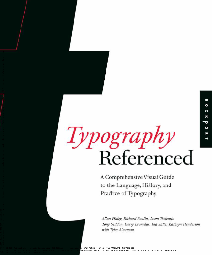
Figure 1.7: Typography Referenced by Allan Haley, Richard Poulin, Jason Tselentis, etc
Format
Designers take note of the size and proportion of the page in which they will work.
The Golden Section
Refers to the ratio between two numbers 1:1.618. Also represented as a:b = b:(a+b). It is used to create a harmonious relationship between graphic elements placed on the page.

ISO Formats
Most designers and printers out of the United States use the International Standard Organizations (ISO) format system:
- A1: 23.39 x 33.11 inches
- A2: 16.54 x 23.39 inches
- A3: 11.69 x 16.54 inches
- A4: 8.27 x 11.69 inches
WEEK 4
Typography Referenced by Allan Haley, Richard Poulin, Jason Tselentis, etc.
I continued reading another chapter from this book because I find it quite interesting
Focal Point
Dynamic compositions, especially one's to attract a viewer's attention, often employs a focal point that does not allow a reader to scan starting with the top-left corner. The composition gives the designers control, telling the reader what to read first on the format. Contrast, size, shape, typeface, colour and texture create these focal points.
Focal Point Enhancements
Other types of format contrast the enhance focal point include, but are not limited to:

WEEK 5
Just My Type by Simon Garfield

Figure 1.10: Just My Type by Simon Garfield
The Worst Fonts in The World
There are many reasons why we dislike or distrust certain fonts. It may trigger memory: Gill Sans can summon up exam papers and Trajan may remind us of lousy choices at the cinema.
In 2007, Anthony Cahalan published his study of font popularity. He sent an online questionnaire to more than a hundred designers, and asked them to identify:
- The fonts they used most
- The ones that are highly visible
- The ones they liked least
Based on the questionnaire:
Used Regularly
- Frutiger
- Helvetica/Helvetica Nueu
- Futura
- Gill Sans
- Univers
- Garamond
- Bembo; Franklin Gothic
- Minion
- Arial
Highly Visible
- Helvetica/Helvetica Nueu
- Meta
- Gill Sans
- Rotis
- Arial
- ITC Officina Sans
- Futura
- Bold Italic Techno
Least Favourite
- Times New Roman
- Helvetica/Helvetica Nueu
- Brush Scripts
- Arial; Courier
- Rotis; Souvenir
- Grunge Fonts
- Avant Garde; Gill Sans
- Comic Sans


