ADVANCED TYPOGRAPHY/TASK 1: EXERCISE 1 & 2
22/04/2024 - 13/05/2024 / Week 1 - Week 4
Marsya Arisa Binti Mahmud / 0359684
Advanced Typography / Bachelor of Design (Hons) in Creative Media / Taylor's University
Task 1: Exercise 1 & 2
Table of Contents
LECTURES
WEEK 1 - TYPOGRAPHIC SYSTEMS (22/04/24)
There are 8 major variations with an infinite number of permutations:
- Axial
- Radial
- Dilational
- Random
- Grid
- Modular
- Transitional
- Bilateral
Axial
All elements are organised to the left or right of a single axis (axis can be bent)

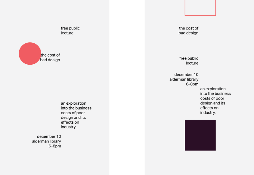
Figure 1.1: Example of Axial (source: type365)
Radial
All elements are extended from a point of focus
Dilational
All elements expand from a central point in a circular fashion
Random
Elements appear to have no specific pattern or relationship
Grid
A system of vertical and horizontal divisions

Figure 1.2: Examples of Radial, Dilational, Random and Grid
Modular
A series of non-objective elements that are constructed in as a standardised unit
Transitional
An informal system of layered banding
Bilateral
All text is arranged symmetrically on a single axis

Figure 1.3: Examples of Modular, Transitional and Bilateral
WEEK 2 - TYPOGRAPHIC COMPOSITION (29/04/24)
1. Principles of Design Composition
- Isolation
- Repetition
- Symmetry
- Asymmetry
- Alignment
- Perspective

Figure 1.4: Principles of Design (source: Pinterest)
2. Rule of Thirds
Suggests that a frame can be divided into 3 columns and 3 rows. Intersecting lines are used a guide to place the point of interest.

Figure 1.5: Rule of Thirds (source: NicholasTinelli)
3. Typographic Systems - Grid
From the 8 systems, the most used system is the Grid System. The modular nature allows an infinite number of adaptations.

Figure 1.5: Grid System (source: michakap)
4. Environmental Grid
An exploration of an existing structure or numerous structures combined.

Figure 1.6: Environmental Grid
5. Form and Movement
The placement of a form on a page, over many pages creates movement (paper or screen is irrelevant).

Figure 1.7: Form and Movement
WEEK 3 - CONTEXT AND CREATIVITY (06/05/24)
The first mechanically produced letterforms were designed to directly imitate handwriting. Handwriting would become the basis or standard for form, spacing and conventions mechanical type would try and mimic.

Figure 1.8: Evolution of the Latin Alphabet
Cuneiform (3000 B.C.E)
The earliest system of actual writing, used in a number of languages between the 34C B.C.E. through the 1st century C.E.
Hieroglyphics (2613 - 2160 B.C.E.)
The Egyptians writing systems is fused with the art of relief carving. A mixture of both rebus and phonetic characters. Hieroglyphic images have the potential to be used in three different ways:
- As ideograms to represent the things they actually depict
- As determinatives to show that the signs preceding are meant as phonograms and to indicate the general idea of the word
- As phonograms to represent sounds that spell out individual words
Early Greek (5th B.C.E.)
Built on the Egyptians logo-consonantal system, the Phoenicians developed a phonetic alphabet consisting of 22 letters. The strokes grew thicker overtime, the aperture lessened and serifs appeared. Served as models for formal lettering in imperial Rome.
Roman Uncials
By the 4th century Roman letters were becoming more rounded, the curved form allowed for less strokes and could be written faster.
English Half Uncials (8th C.)
In England the uncials evolved into a more slanted and condensed form. While English and Irish uncials evolved, writing on the European continent devolved considerably and needed a reformer.

Figure 1.9: Cuneiform - English Half Uncials
Emperor Charlemagne (8 C. CE)
After the Roman Empire, the end of a central advanced culture resulted in general illiteracy and a breakdown of handwriting into diverse regional styles.
Carolingian Minuscule
The Carolingian miniscule was used for all legal and literary works to unify communication between the various regions of the expanding European empire. It is a development of the standard Roman capital.
Black Letter (12-15 C. CE)
Gothic was the culminating artistic expression of the middle ages, roughly from 1200-1500. Black Letter has condensing line spacing and letter spacing reduced the amount of costly materials in book production.
The Italian Renaissance
Newly rediscovered letterforms Antica. The renaissance analysis of form that was being applied to art and architecture was directed toward letterform resulting in a more perfect or rationalised letter.
Movable Type (11 C. - 14 C.)
Printing had already been practiced in China, Korea, and Japan. The introduction of moveable type was introduced in the 1000-1100 CE. The Koreans establish a foundry to cast movable type in bronze.

Figure 1.10: Emperor Charlemagne - Movable Type
WEEK 4 - DESIGNING TYPE (13/05/24)
General Process of Type Design:
1. Research
When creating type, we should understand type history, type anatomy and type conventions. It is important to determine the type's purpose or what it would be used for.
2. Sketching
Some designers sketch their typeface using the traditional tool set (brushes/pens, ink and paper) then scan them for the purpose of digitization. Some designers sketch their typeface using digital tool sets, such as Wacom directly into a font design software. Both methods have their positives and negatives.

Figure 1.11: Sketches
3. Digitization
There are softwares that are used in digitization of typefaces: FontLab and Glyphs. Some designers use Adobe Illustrator to design or craft the letterforms and then introduce it into the specialized font apps. Attentions should not be given to the whole form at this stage but also to the counter form. The readability of the typeface is heavily dependent on it.
4. Testing
Testing is an important component in the design thinking process. The results of the testing is part of the process of refining and correcting aspects of the typeface. Prototyping is also part of the testing process and leads to important feedback.

Figure 1.12: Prototype Stencil
5. Deploy
Even after deploying a completed typeface there are always teething problems that did not come to the fore during the prototyping and testing phases. The rigour of the testing is important in so that the teething issue remain minor.

Figure 1.13: Number Plate Prototype
Construction and Considerations:
Depending on the form and constructions, the 26 characters of the alphabet can be arranged into groups, whereby a distinction is made between a group for the capitals and a group of lowercase letters.

Figure 1.14: Construction and Consideration
INSTRUCTIONS
1) Typographic Systems: Exercise 1
- Create typographic messages through the eight systems of typographic organizations: Axial, Radial, Dilational, Random, Grid, Modular, Transitional, Bilateral
- Size: 200mm x 200 mm
- Only one other colour besides black
- Graphical elements can be used but limitedly (line, dot, etc)
2) Type & Play: Exercise 2
- Select an image of a man-made object (chair, glass, etc) or structures (buildings) or something from nature (human, landscape, leaf, plant, clouds, etc)
- Ensure image does not contain many different elements
- Analyse, dissect and identify potential letterforms within the image
- Explore and digitise the letterforms
- Combine the letterforms with an image that is the basis of the extracted letters (must have symbolic relationship with the image)
<iframe src="https://drive.google.com/file/d/1x9VGZJome-klGEE1rdxipmy8NaK-g4k9/preview" width="640" height="480" allow="autoplay"></iframe>
WORK PROCESS
1) TYPOGRAPHIC SYSTEMS: EXERCISE 1
Week 1 Exercise (22/04/2024)
For our first exercise, Mr. Vinod gave us a recap on InDesign formatting and demonstrated the axial typographic system. He provided a line of text to work with and taught shortcut keys to make it easier.
Shortcut Keys:
- Increase size: Command + Shift + Greater Than (>)
- Increase leading: Option + Down Arrow
- Force break the text (maintain leading): Shift + Enter
- Increase letter spacing: Option + Right Arrow
- En dash (–): Option + Minus
- Align height to centre: Command + B

Figure 2.1: Axial System Exercise with Grid

Figure 2.2: Axial System Exercise without Grid
Axial Typographic System (25/04/2024)
For axial, I wanted to do one straight axis and a tilted axis. I followed the process Mr. Vinod taught us by prioritising the important information first. Then went through the 10 fonts provided to pick the right font to go with my layout.
Fonts Used:
- Left - Janson Text LT Std (75 Bold & 55 Roman)
- Right - Univers LT Std (65 Bold & 55 Roman)
Draft 1


Figure 2.3: Layout for First Draft
I decided to add a different colour to the other half of the text and incorporated a graphical element because I felt like it was too empty. One of the left column and one on the right to balance it out.
Draft 2
In order to tilt my axis I needed to make sure that the texts were evenly spaced. So I curated my layout on a straight axis before rotating the texts. This time, I decided to explore the position of the texts and I added a line to imply the axis because the information looked more organised.

Figure 2.4: Layout for Second Draft
Radial was difficult for me when coming up with a draft because I could not figure out where to place the point of focus or where to angle/place the texts. I added one point of focus and two on the other. Initially, the second design had more circular elements but I found it to be overbearing.
Fonts Used:
- Left - Serifa Std (65 Bold & 55 Roman)
- Right - Gill Sans (Bold & Regular)

Figure 2.5: Radial Drafts with Grid
After feedback, Mr. Vinod mentioned that each line of text needs to radiate around the point of focus instead of blocks of texts.

Figure 2.6: Radial Typographic System
For the dilational system, I had to figure out how to curve the texts through video tutorials, which was to use the ellipse tool to outline a circle then create a path tool to add the texts. I created a grid out of these circles and experimented with the position. I first added the header and the venue on the upper corner of the circles because by default it is what viewers would see first.
Font Used: Univers LT Std (65 Bold & 55 Roman)

Figure 2.7: Dilational Typographic System Process
After feedback, Mr. Vinod said that the colour was not visible with the white background. I adjusted the colours to make the text pop out more.
Random Typographic System (26/04/2024)
I find this the hardest typographic system to design mainly because there are no relationships between the elements. Because I was used to a pattern, trying to avoid having a pattern made it difficult. I started with figuring out the position of the texts before adding other elements.
Font Used: ITC Garamond Std (Bold, Book & Light)

Figure 2.8: Random Typographic System Process
Mr. Vinod suggested to not use two colours as the background, so I removed the black section and changed the text colour to make it visible.
Modular Typographic System (26/04/2024)
For modular, I used boxes to imply a standardised graphical element. I then added the text to determine the layout of the design.
Font Used: Janson Text LT Std (75 Bold & 55 Roman)

Figure 2.9: Modular Typographic System Process
Mr. Vinod mentioned during the feedback session that certain sections of the grid looked too heavy, and suggested to move 'Lecture Hall 12' on the lower part of the grid.
Transitional Typographic System (28/04/2024)
For transitional, I used waves and placed them in a way that correlates each line of text to make them look split up but also connected at the same time.
Font Used - ITC Garamond Std (Bold & Book)
Figure 2.10: Transitional Typographic System Process
Bilateral Typographic System (28/04/2024)
Bilateral meant centre align but I decided to centre align the texts more towards the left side of the grid. I then decided to add graphical elements like lines and a circle so that it would not look too bland.
Font Used - Bembo Std (Bold & Regular)

Figure 2.11: Bilateral Typographic System Process
FINAL SUBMISSION (TYPOGRAPHIC SYSTEMS: EXERCISE 1)

Figure 2.11: Final Axial (JPEG)

Final 2.12: Final Radial (JPEG)

Figure 2.13: Final Dilational (JPEG)

Figure 2.13: Final Random (JPEG)

Figure 2.14: Final Grid (JPEG)

Figure 2.15: Final Modular (JPEG)

Figure 2.16: Final Transitional (JPEG)

Figure 2.17: Final Bilateral (JPEG)
Figure 2.18: Final Typographic System (PDF)
<iframe src="https://drive.google.com/file/d/1IdHLiEnDxYaKg6pzUV72c82Efueo_Ucw/preview" width="640" height="480" allow="autoplay"></iframe>
Figure 2.19: Final Typographic System with Grid (PDF)
<iframe src="https://drive.google.com/file/d/1los_l1cxl883HWaezKk21RNRnXS4b2Vs/preview" width="640" height="480" allow="autoplay"></iframe>
2) TYPE & PLAY: EXERCISE 2
Image
I found this image off Pinterest and found a few letters that could be extracted from the image. I also find the structure of the potential letterforms interesting.

Figure 2.20: Chosen Image
Extracting Letterforms
When tracing out the letterforms in the image, the letters to be extracted were: S, W, A,Y, B, Z, e. I ended up choosing SWAY because it formed a proper word and the font structure made sense to word itself.

Figure 2.21: Extracted Letterforms
Extracted Letterforms
After tracing out the image with potential letterforms, I extracted it on Adobe Illustrator. This is what I ended up with:

Figure 2.22: Extracted Letterforms
Reference Font
For my reference font, I went with Serifa Std 24 Light. Mainly because it resembles my extracted letterforms the most out of the 10 fonts that were provided. I began tracing out my letters whilst still keeping the curls from the original letters.

Figure 2.23: Reference Font
Final Type

Figure 2.24: Final Type
FINAL SUBMISSION (TYPE & PLAY: EXERCISE 2)
Figure 2.25: Image

Figure 2.26: Extracted Letterforms (JPEG)

Figure 2.27: Reference Font (JPEG)

Figure 2.28: Final Letterforms on Baseline (JPEG)

Figure 2.29: Extraction Process

Figure 2.30: Original Extraction vs Final Letterforms (JPEG)

Figure 2.31: Type Showcase (JPEG)
<iframe src="https://drive.google.com/file/d/1-acDzXqlyI36tkgIRIG9vQgVxDgeZpkp/preview" width="640" height="480" allow="autoplay"></iframe>
FEEDBACK
WEEK 2 - 29/04/2024
General
Compile multiple visuals to avoid lengthening the blog
Specific
- Axial - Try not to tilt too much
- Radial - Each line of text needs to be tilted towards a focus point instead of a block
- Dilational - Font colour is not visible
- Modular - Heavier on the right, have the venue on the lower block
- Transitional - Too safe
- Bilateral - Move the graphical element to the middle so it does not shift away from the canvas
WEEK 4 (13/05/24)
General
- Ensure other texts do not overpower the title by size.
- Use an image that complements the font and ensure there is contrast.
- Inter-letter spacing is better when bigger.
REFLECTION
Experience
I gained knowledge on the design principles and how it applies to Typography. I also got to recap my abilities on Adobe InDesign from my last two semesters, I referred to the shortcut keys that were taught to make it more efficient when coming up with my layout. When it came to applying the 8 design principles, I had to fully understand how grids work. The lecture notes provided including other external sources helped me get a better understanding, including ways I could experiment without breaking the rules. In exercise 1, we were allowed one other colour apart from black and white. It took awhile to find a colour I liked, eventually I chose yellow because it stood out the most and it looked good as a base to me. When it came to layout designing, the grids helped me with my text placement in a way that aligns my texts and establishes which information was more important. Personally, the most difficult to design was 'Random', because there was no limitations on placement, I had to figure out a way for it to be non-systematic. I got a better idea of how to improve my design after the feedback session, Mr. Vinod provided specific feedback so I knew what I had to work on. Exercise 2 was more difficult than Exercise 1, mainly because I struggled tracing the image smoothly. Upon extracting the fonts I needed to refine it, which was also something I struggled on Adobe Illustrator. It does help with a reference font though, because I would then have a base to refer to. My font came out a lot more cleaner. The process of designing the movie poster took awhile, I had to find an image that resonates with my final font. I tried to use vines, trees and Medusa (Greek Mythology) but none of it was working. Until I realised the font was playful and it reminded me of candy canes. I went through images of candy canes and tested out the font to see if it made sense. I completed the posters with a few captions and logos.
Observations
I observed that it is important to consider the point size, point weight, leading and letterspacing in the text because it brings a large impact to the overall design. There needs to be a good balance between the text and white space in order to make it look organized. Bold texts come off as more important than regular texts, viewers will pay attention to the bold text first. Therefore, hierarchy of text needs to be established beforehand. To keep the layout more systematic, it is important to depend on grids so that texts are aligned with one another. The fonts chosen could also be used as a guideline for the layout. I realise some fonts do not work with certain layouts I came up with. For exercise 2, tracing out the image itself helps with extracting the letterform rather than attempting to imitate the letterforms from the image. I find that using a baseline helps with keeping an even level for the letters and it is necessary to have a reference font for the refining process to make your letterforms come out smoother.
Findings
I find that you need to be familiar with the rules of each system in order to experiment with the layout, but I can't be too safe with my layout either. A good balance between following the principles and playing with placement is ideal for the design. I find that it is best to stick to simpler colours so that it looks more organised. For exercise 2, I find that it is important to refine the letterforms in a way that doesn't give away its initial characteristics. because this is important when it comes to choosing an image for my movie poster. It needs to blend in well to look whole.
FURTHER READING
Typographic Systems by Kimberly Elam

Figure 6.1: Typographic Systems by Kimberly Elam (2007)
Constrains and Options
Within any process there are typographic constraints and options that provide opportunities for rich yet subtle variations. Leading is variable, which creates changes in position and texture. Variable word spacing and letter spacing creates distinct changes in texture and tone.
Line Breaks: Lines may be broken at will to create multiple lines.
Leading: Leading can be tight to overlapping or wide and airy.
Word and Letter Space: Used to create different textures. As letter spacing increases, word spacing must also be increased to avoid confusion.
Non-Objective Elements
Non-objective elements articulate and sharpens the composition. It enhances the functions of emphasis, organization, and balance. These elements become functional guides when used with typography. They strengthen a message by communicating a sense of organisation and direction.
Rule Series: Both organises and emphasises the message. Single-weight rules of equal length function primarily as elements of organisation. Changes in rule weight create a hierarchy.
Circle Series: Acts as a pivot point or an element that creates hierarchy. The circle draws the eye to a single word.
Tone Series: Tone cane dramatically alter the hierarchy of a message. Words of portion of words can be emphasised, giving the message a sense of visual punctuation.
Finding Type: A Novel Typographic Exercise by Vinod Nair

Figure 6.2: Finding Type: A Novel Typographic Exercise by Vinod Nair (2023)
Steps taken to conduct this Typography exercise:
- Finding an image
- Deconstructing an image
- Identifying letterforms
- Extracting letterforms
- Identify a reference
- Refining letterforms
This article explains these steps in depth.


