TYPOGRAPHY/FINAL COMPILATION & REFLECTION
29/09/2023 - 05/01/2024 / Week 1 - Week 14
Marsya Arisa Binti Mahmud / 0359684
Marsya Arisa Binti Mahmud / 0359684
Typography / Bachelor of Design (Hons) in Creative Media / Taylor's University
Final Compilation & Reflection
INTRUCTIONS
Task 1: Exercise 1 & 2
Task 3: Type Design and Communication
SUBMISSIONS
TASK 1/Exercise 1: Type Expression
30/09/2023 - 27/10/2023 / Week 1 - Week 5
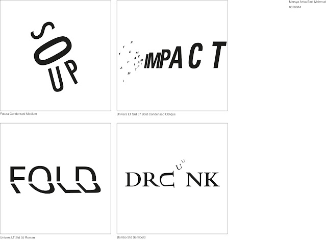
Figure 1.13: Final Type Expression
Figure 1.2: Final Type Expression (PDF)
<iframe src="https://drive.google.com/file/d/1MTaS00k17IqKh1BdT1D1OU2jmHS9dtcT/preview" width="640" height="480" allow="autoplay"></iframe>
Figure 1.3: Final Animated Type Expression
TASK 1/Exercise 2: Text Formatting
30/09/2023 - 27/10/2023 / Week 1 - Week 5
Head
- Font: Adobe Caslon Pro Bold
- Type Sizes: 20 pt (heading) 14 pt (subheading)
- Leading: 22 pt
- Paragraph Spacing: 22 pt
Body
- Font: Adobe Caslon Pro Regular
- Type Size: 10 pt
- Leading: 12 pt
- Paragraph spacing: 12 pt
- Characters per-line: 56 - 60
- Alignment: Left Justified
- Margins: 12.7 mm top / 12.7 mm left / 12.7 mm right / 50 mm bottom
- Columns: 4
- Gutter: 8 mm
Figure 1.4: Final Text Formatting Layout
Figure 1.5: Final Text Formatting Layout with Grid
Figure 1.6: Final Text Formatting Layout (PDF)
<iframe src="https://drive.google.com/file/d/1c4BxyxDSHGuJqCmq4TGMdajXd-fkWkaA/preview" width="640" height="480" allow="autoplay"></iframe>
Figure 1.7: Final Text Formatting Layout with Grid (PDF)
<iframe src="https://drive.google.com/file/d/10lQp9uNfF-prnYiqQS-IwGBjr01qOhmE/preview" width="640" height="480" allow="autoplay"></iframe>
TASK 2/Typographic Exploration and Communication
03/11/2023 - 10/11/2023 / Week 6 - Week 7
- Font: Univers LT Std 55 Roman
- Type Size: 8 pt
- Leading: 10 pt
- Paragraph spacing: 10 pt
- Characters per-line: 44
- Alignment: Justified
- Margins: 10 mm top / 10 mm left / 10 mm right / 10 mm bottom
- Columns: 3
- Gutter: 5 mm
Figure 2.1: Final Editorial Spread
Figure 2.2: Final Editorial Spread with Grid
Figure 2.3: Final Editorial Spread (PDF)
<iframe src="https://drive.google.com/file/d/1pewfi6CYfRiWoO0dqFSYWmw2LjoNh39b/preview" width="640" height="480" allow="autoplay"></iframe>
Figure 2.4: Final Editorial Spread with Grid (PDF)
<iframe src="https://drive.google.com/file/d/1Yb5H5hVLH7ij-IoN-ZHXqOxig133ktqw/preview" width="640" height="480" allow="autoplay"></iframe>
TASK 3/Type Design and Communication
Link to Download Font here: https://drive.google.com/drive/folders/1tM2BE-Y1kfe_-ZKWkcg9cHwerPW_uK_r?usp=sharing
Figure 3.1: FontLab Screengrab
Figure 3.2: Final: Type Design and Communication, "SciFi" (JPG)
Figure 3.3: Final: Type Design and Communication, "SciFi" (PDF)
<iframe src="https://drive.google.com/file/d/1HOhJBz39Ulk3I5qNkS9cGCGbzWDxX_Lx/preview" width="640" height="480" allow="autoplay"></iframe>
Figure 3.5: Final Poster (PDF)
<iframe src="https://drive.google.com/file/d/13XwwguvmBB_5lwifhEN02P-zAxYK1sK2/preview" width="640" height="480" allow="autoplay"></iframe>
REFLECTION
Experience
Throughout this module, I've managed to learn new Typography concepts and the right ways to apply these concepts in the real world. For instance, I was taught to illustrate and animate words to correlate to its meaning through Adobe Illustrator and Adobe Photoshop. This gave me an idea on how to express certain words in a more visualised manner. I also learned the concept of creating a layout as well as editing headlines, subheadings and paragraphs through Adobe InDesign when dealing with large amounts of texts like articles and newspapers. Our final project for this semester includes sketching out our fonts with different sized markers, illustrating these fonts on Adobe Illustrator, importing these fonts onto FontLab and finally, creating a poster out of the font. this project gave me a better understanding on how fonts are generally created on different platforms and that there are general guidelines these designers refer to such as having baselines, x-height, ascender lines, descender lines and cap height.
Observations
Each aspect of this module has different ways of applying different designing concepts. At the start, it was challenging but once you get the idea and leave space for alterations after feedback, it becomes fun especially when you're satisfied with the outcome. I learned that updating your e-portfolio is not only for our lecturers to see our work, but it also helps keep track of your progress throughout the semester and how far your skills have developed later on in this degree. Further reading has also helped me with expanding my knowledge because surprisingly 4 hours of class once a week is not enough to cover everything you can learn in Typography and the more you read, the less trouble you have coming up with ideas for these projects. Lastly, it's important to have a rough idea/sketch before carrying out the main parts of the project, giving room to experiment with your ideas later on if needed.
Findings
The findings in this module covers most of the main Typography theories. For GIF animations, increasing the number of frames per second helps enhance the smoothness of your animation, depending on how you wish to visualise the meaning of the words. Kerning, tracking and experimenting with fonts impacts the text aesthetic significantly, even with slight alterations. Letterform consistency is important, especially when it comes to having consistent and even strokes. Graph paper helps with guidelines when sketching your letterforms. It is also important to determine the measurements of your baseline, x-height, cap height, ascender line and descender line for easier guidelines and reference when creating a font. Lastly, manual adjustment to bearings should be used when necessary for even letter spacing.


