ADVANCED TYPOGRAPHY/TASK 2: KEY ARTWORK & COLLATERAL
13/05/2024 - 03/06/2024 / Week 4 - Week 7
Marsya Arisa Binti Mahmud / 0359684
Advanced Typography / Bachelor of Design (Hons) in Creative Media / Taylor's University
Task 2: Key Artwork & Collateral
LECTURES
Lectures from Week 1 - Week 4 are documented in Task 1
WEEK 5 - PERCEPTION AND ORGANISATION (20/05/24)
Perception
Perception in typography deals with the visual navigation and interpretation of the reader via contrast, form and organization.
Contrast
There are several methods in typography to create contrast:
- Contrast in Size: Provides a point to which the reader's attention is drawn. Bigger letters are seen first before smaller letters, normally the heading is bigger than the body text.
- Contrast in Structure: Structure means different letterforms of different kinds of typefaces. (sans serif and traditional serif, italic and blackletter)
- Contrast in Texture: By adding contrast of size, weight, form and structure. It gives contrast of texture to the page.
- Contrast in Direction: The opposition between vertical and horizontal, and the angles in between. Turning a word on its side can give off a dramatic effect.
- Contrast in Color: It is important to give thought to which element needs to be emphasized and to pay attention to tonal values of colors.
Refers to the overall look and feel of the elements that make up the composition. It plays a role in visual impact and first impressions. When a typeface is perceived as a from, it no longer reads as a letter because it has been manipulated by distortion, texture, enlargement and has been extruded into a space.
Figure 1.2: Typographical Form
Organization
The way a thing has been placed or put together. Gestalt theory emphasizes that the whole of anything is greater than its parts. Therefore in design, the elements make up the design is only as good as its overall visual. The gestalt principles consists of:
- Proximity: Elements closed together are perceived as grouped together.
- Similarity: Elements similar to each other tend to be perceived as unified.
- Continuity: To perceive each of two or more objects as different, singular and uninterrupted even when they intersect.
- Closure: The mind's tendency to see complete figures of form even if a picture is incomplete.
- Area: Our brain distinguishes elements in the foreground or background of an image. This principle teaches us to use negative space creatively.
- Symmetry: There are various interpretations. It is the form of laying out complex content in a hierarchical manner.
Figure 1.3: Gestalt Principles
INSTRUCTIONS
a) Key Artwork
Explore and compose as many permutations and combinations of your name in the form of a word mark.
- Export JPEG, grayscale, 300ppi (black & white, in colour and in reverse)
b) Collateral
Design a shirt, label pin, an animated key artwork and an Instagram account, transforming the key artwork into a brand.
- Animated key artwork: 800/1024 px, height and width, GIF format
<iframe src="https://drive.google.com/file/d/1x9VGZJome-klGEE1rdxipmy8NaK-g4k9/preview" width="640" height="480" allow="autoplay"></iframe>
TASK A: KEY ARTWORK
To understand my identity better, I created a mind map of my personality to see how I could portray myself best:
Mood Board
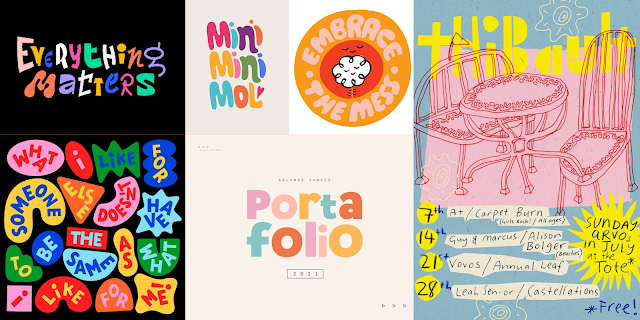
After creating the mind map, I created a mood board to gain ideas on my visual identity, I wanted to come off as bubbly and playful, in a way that reminded me of my childhood. So I looked up designs that were colourful. I found a few designs that reminded me of socks I would wear on a daily basis, filled with cartoons and graphics.
Figure 1.2: Mood Board
Sketches
Then, I sketched out my ideas to determine the possible outcomes I could illustrate. Out of the 3, I felt as though the first one matched my aesthetic the best. I've been told the second one could be read out as 'Mars ya' instead of my 'Marsya' and the third one seemed more arts and craftsy instead of of bubbly.
The reason I went for the first one is because it resembles flower petals blossoming, Marsya means blossom. The flow of the letterforms is flowy, which represents musical notes on the music sheet because music is something I am pursuing apart from design. I also prefer the first one because it gives off that I am 'playful' and 'childlike'.
Digitization
I traced out my chosen sketch using the pen tool then refined it to ensure there were no inconsistencies. Then, I used the circle tool to create a constant wave for my illustration. I wanted an aspect of the illustration to be more playful so I enhanced the circles on the a's. I further explored with my layout by expanding my Y, making it look more like musical notes. I still settled on the original sketch because the 'Y' looked more like a 'J'.
Figure 1.4: Digitisation
Color Palette
I went on color hunt to look for possible color palettes and applied to the my finalized digitization. I was conflicted between choosing a solid color or making it colorful because initially I wanted it to be colorful, but having a solid color makes it minimalistic for the goal I was going for.
Figure 1.5: Colour Palette
TASK 2 (A) FINAL SUBMISSION
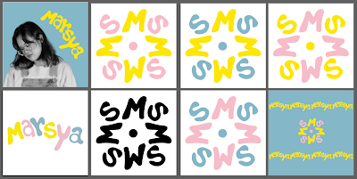
1.7: Black and White (JPEG)
1.8: In Colour (JPEG)
1.7: In Reverse (JPEG)
1.8: Color Palette (JPEG)
1.9: Self Portrait (JPEG)
Figure 1.10: Final Key Artwork (PDF)
<iframe src="https://drive.google.com/file/d/1U1j2HOzwtENpJapTfWEmIP1TFoVisfpG/preview" width="640" height="480" allow="autoplay"></iframe>
TASK B: COLLATERAL
With my key artwork complete, this task requires me to expand my artwork from task 1 into 3 items
(mockups) and portraying this visual identity on an Instagram page.
When Mr. Vinod mentioned I needed to visualise what my artwork could represent, the first thing I thought of was an independent coffee shop/cafe because I enjoy doing work at new cafes and trying out their unique coffee blends. I like the idea of having a place where people could do their work, whilst still feel that sense of 'playfulness', to reminisce their childhood again.
List of mockup items:
- Bottles
- Reusable Cups
- T-Shirts
- Apron
- Stickers
- Coffee Bean Packaging
- Gift Card/Vouchers
To complement my local coffee shop idea, I decided to do a mockup of a bottle, reusable cups and coffee bean packages.
Bottle
Mr. Vinod provided a website that does mockups using AI. I found a template for a bottle and imported my key artwork.
For my key artwork expansion, I wanted my logo to look like a flower. And because I intend to call the coffee shop 'Marsya's Specialty', I incorporated the 'M' and 'S' from my key artwork. I realised it did not resemble a flower, I decided to add the circle from my 'a' as the seed.
Figure 1.8: Key Artwork Expansion
Reusable Cups
For my reusable cups mockup, I used photoshop because I wanted the background to have a specific colour to fit my Instagram page. I placed my logo onto the cups and created two different background colours (yellow made my mockup blend in with the background so I added shadow to create contrast):
Figure 1.9: Reusable Cup Mockups
Coffee Bean Packaging
I used photoshop to create this mockup. I used the spot healing tool to erase the original text from the original image and added my logo onto the package with a few effects to help it stand out.
Figure 1.10: Coffee Bean Package Mockup
GIF Animation
Final GIF
Instagram Page
I created an Instagram page called @marsyaspecialty to curate my identity.
Figure 1.12: Instagram Page
TASK 2 (B) FINAL SUBMISSION
Collateral 1 - Coffee Bean Packaging
Instagram Link
Instagram Screen Grab
FEEDBACK
WEEK 5 (20/05/2024)
Readability of the texts is important. To many graphical elements or thin points make it harder to read.
Enough exploration of your identity needs to be documented.
REFLECTION
Experience
Creating a mind map to reveal characteristics of myself was not just helpful, it also became a strong source of inspiration as I executed my craft. As someone uncomfortable with the idea of being closer to my mid-twenties, I found it reassuring to find that I am still childlike. Through exploring the meaning of my name and tying it into my love for caffeine to cope with stress from adulthood, my journey transformed into one of self discovery. It was a joy to create the Instagram page as well, seeing as my childhood dreams once consisted of entrepreneurship.
Observations
As someone used to formulating an idea and going full speed ahead with it rather than revisiting certain aspects for refinement, this assignment provided a “perfecting” template for me to apply in my next endeavor. It taught me that brainstorming can be both fluid and structured as I am limitless in my head but limited in my knowledge and offered software features. Moreover, I truly learned that patience is a virtue through the process of unifying my love for music and the meaning of my name which is “blossom”. Incorporating flowers and musical notes to lend more meaning to my typography was much more gratifying than my initial draft.
Findings
There are many AI tools available to streamline design. While the branding I have done is prototypal, I believe in the real world application of the mockup AI website I used to create my merchandise in completing an actual business proposal. I also found the numerous sample photos online helpful in creating fulfilling merchandise shots, providing me with an idea of what I might want as media supply in my future projects. For example, the high definition pictures of sleek coffee shops were satisfying up to an extent as I could not find more childlike atmospheres that complement my idea more.
FURTHER READING
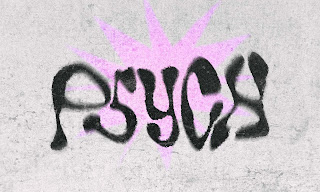
4.1: Creating a Font with Font Forge by Rhyanne C. Lowe
This article explains how Rhyanne uses the TV show 'Euphoria' as an influence to her typeface and her thought process behind it. She provides useful tips and video tutorials to explain the process of her coming up with her final outcome.
Typographic Design: Form and Communication by Rob Carter, Philip B. Meggs, etc.
Figure 4.2: Typographic Design: Form and Communication by Rob Carter, Philip B. Meggs, etc.
Four major variables control letterform proportion and have considerable impact upon the visual appearance of a typeface.
- Stroke-to-height ratio: The height of the letter is ten times the stroke width. In adjacent rectangles, the centre letter is reduced to one half the normal stroke width.
- Contrast in stroke weight: A change in contrast between thick and thin strokes can alter the optical qualities of letterforms.
- Expanded and condensed styles: The design qualities of a typographic font change dramatically when the widths of the letterforms are expanded and condensed. The stroke height ratio is 1 to 9.
- X-height and proportion: Proportional relationship between the x-height and capital, ascender, and descender heights influence the qualities in a significant way. The same characters are set in 72-point type using three typefaces with widely varying x-height.


