ADVANCED TYPOGRAPHY/TASK 3: TYPE EXPLORATION & APPLICATION
13/06/2024 - 11/07/2024 / Week 8 - Week 12
Marsya Arisa Binti Mahmud / 0359684
Advanced Typography / Bachelor of Design (Hons) in Creative Media / Taylor's University
Task 3: Type Exploration & Application
LECTURES
INSTRUCTIONS
Create a font that is intended to solve a larger problem or meant to be part of a solution. The end outcome could be a designer font and its application in the form or format that it is intending to provide a solution to, or a designed font that adds value to an existing use.
<iframe src="https://drive.google.com/file/d/1x9VGZJome-klGEE1rdxipmy8NaK-g4k9/preview" width="640" height="480" allow="autoplay"></iframe>
PROCESS WORK

Figure 1.1: Proposal
I find the main logo intriguing, but the typeface itself is only used for the logo. Which is why I intend to expand this typeface in a way that can be generally used or resembles this typeface best.
Font Construction
I first analysed and constructed the letters L,I,F,E,S,T,R,A,N,G so that I could use that as a guideline for the rest of my letterforms. I prioritised the knife tool to cut out sections that resemble different letters. I then added the scribble effect to imitate a handwriting structure.
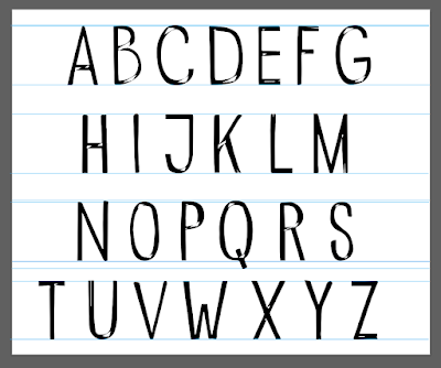
Figure 1.2: Uppercase A-Z

Figure 1.3: Lowercase A-Z

Figure 1.4: Numerals and Characters
FontLab
Before setting the letter space, I imported the font from Adobe Illustrator to FontLab. There were a few setbacks with my construction. When I imported the letterforms, some of them only had outlines, I then needed to reconstruct some of the letters.

Figure 1.5: Importing from AI to FontLab
Mr. Vinod provided us a guideline for bearings that made it easier to follow. These are the outcomes:

Figure 1.6: Bearing for Uppercase Letters

Figure 1.7: Bearing for Lowercase Letters

<iframe src="https://drive.google.com/file/d/1r0NaMa7QDKVmwB61vVUSZdu31HbBqUoP/preview" width="640" height="480" allow="autoplay"></iframe>
Font Presentation

Figure 1.9: Font Presentation #1

Figure 1.10: Font Presentation #2

Figure 1.11: Font Presentation #3

Figure 1.12: Font Presentation #4

Figure 1.13: Font Presentation #5
<iframe src="https://drive.google.com/file/d/1mdULYqBpm-F8y1SCliRI9oje10DYWwPU/preview" width="640" height="480" allow="autoplay"></iframe>
Font Application

Figure 1.14: Font Application #1

Figure 1.15: Font Application #2

Figure 1.16: Font Application #3

Figure 1.17: Font Application #4

Figure 1.18: Font Application #5
<iframe src="https://drive.google.com/file/d/1oibIWMMFWKRmXWgz1-rtuq4lp7pn-ICl/preview" width="640" height="480" allow="autoplay"></iframe>
Experience
During the Advanced Typography Task 3, my primary goal was to create a unique typeface that addresses a specific problem or adds value to an existing use. This project required me to expand a logo typeface into a full, usable font, incorporating the look and feel of handwriting. The process involved multiple stages: analyzing existing letters, constructing new letterforms, and refining the font using FontLab. One of the major challenges I faced was ensuring consistency across all characters while maintaining the original aesthetic. I also had to troubleshoot various issues that arose when importing and reconstructing letterforms.
Observations
Throughout the project, I observed that the initial design phase is crucial for setting a solid foundation for the entire typeface. The initial analysis and construction of letters like L, I, F, E, S, T, R, A, N, G provided a guideline that helped in maintaining consistency. Using tools like the knife tool and applying a scribble effect were effective techniques for achieving a handwriting-like structure. Moreover, I noted that importing vectors from Adobe Illustrator to FontLab could lead to unexpected issues, such as missing outlines, which required additional adjustments. The guidance provided by Mr. Vinod on bearings was instrumental in achieving balanced letter spacing.
Findings
Through this task, I discovered that creating a typeface is a meticulous and iterative process that demands attention to detail and patience. The experience highlighted the importance of having a clear vision and plan, as well as the flexibility to adapt when encountering setbacks. I found that the combination of creative tools and technical skills is essential for successful type design. Additionally, this project reinforced the value of feedback and guidance from instructors and peers, as it provided new perspectives and helped improve the final outcome. The completion of this typeface not only enhanced my technical abilities but also deepened my appreciation for the art and science of typography.


